Pricing Data
The reports clients relied on, on a platform that was finally ours.
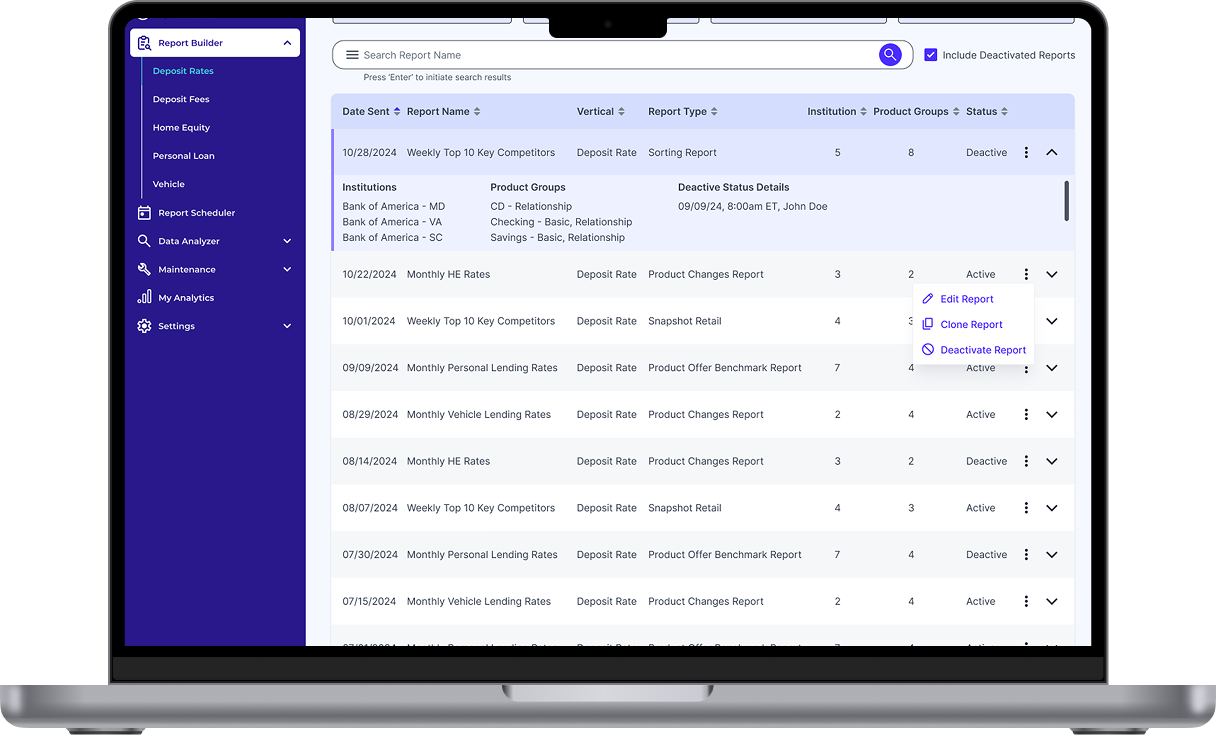
Pricing Data lets clients choose what data they want to receive, in what format, and when, with report creation and distribution automated end to end. It is currently progressing beyond MVP, with UX refinement and feature expansion underway.
Timeline
2024-2025
Team
Senior UX Designer (sole designer), Director of Product Management, Senior Product Manager, Senior Product Analyst, VP of Engineering, Director of Engineering, Engineering Team
Responsibilities
First and only senior UX designer on the product through the MVP. Designed end to end experiences across every reporting vertical for the MVP launch, and ran an accessibility audit on each one. The accessibility documentation became the template other Pricing platform products build from.
Overview
Curinos set out to launch a refreshed product that better reflected its brand and its clients' evolving needs. The company had been relying on Informagic, a platform owned by its parent company, Informa. Moving forward meant building an independent product that preserved familiar functionality while introducing modernized features and a more cohesive experience.
The foundation was already set when I joined. Qualitative research had been completed the previous year and key requirements were outlined by the Director of Product Management, so I could start from the low-fidelity wireframes the Senior PM had drafted. I was the only designer on the product, and I owned the design from that point through to the MVP launch.
Product background
Pricing Data gives clients a deeper peer set tracked to their own footprint, more context behind competitive rates, self service report configuration, and direct access to raw data. Where the old platform delivered reports, this one lets clients decide what a report contains and when it arrives.
How it got built
The Senior Product Manager and I mapped user journeys end to end within each feature, which shaped the information architecture and gave the low fidelity wireframes something concrete to answer to.
The Senior PM had drafted low-fidelity wireframes to establish a starting point. Reviewing them told me what senior management wanted, and it also told me where the designs wouldn't hold. The flow wasn't intuitive to follow as a user, and the screens didn't use the components in our design system at the time. I took ownership of the wireframes, redesigned them against user needs and business goals, and carried them into high fidelity for development.
Working against a tight timeline and limited resources, the MVP designs were handed off in phases over two and a half months, across three features.
The challenge
A brand new product with no client base yet, which meant no one to test with.
Pricing Data was spun off from a legacy platform owned by the parent company, so there was no dedicated client base to recruit from and no UX testing or validation available. I relied on the research Informagic had already accumulated to inform decisions and check the final MVP against.
Low fidelity wireframes
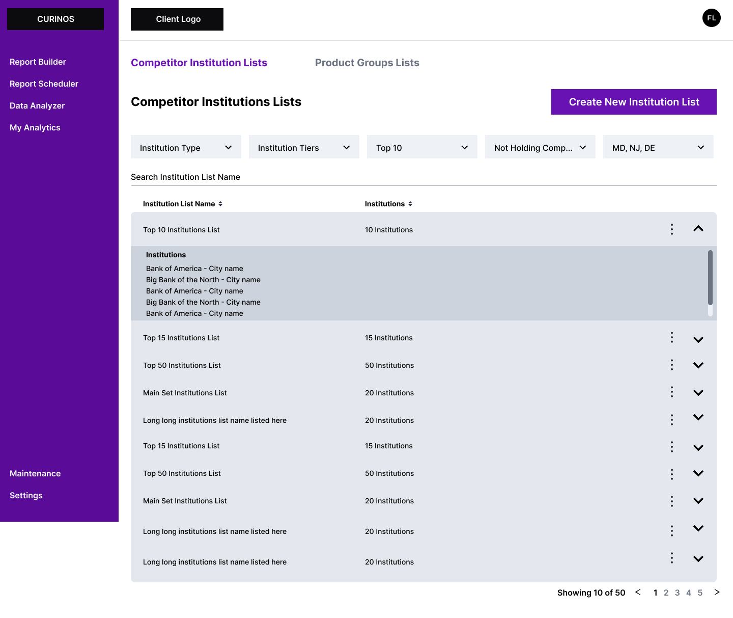
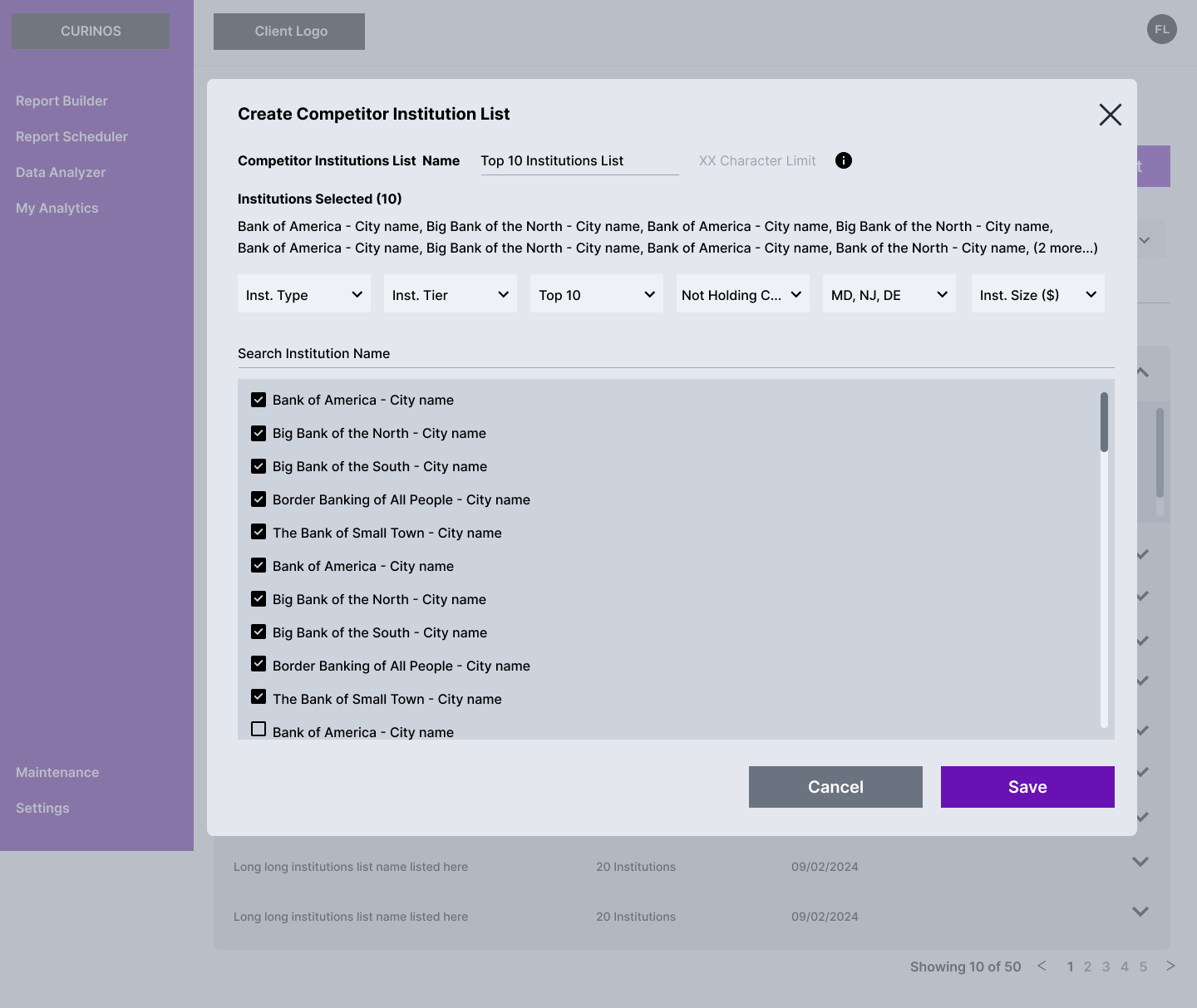
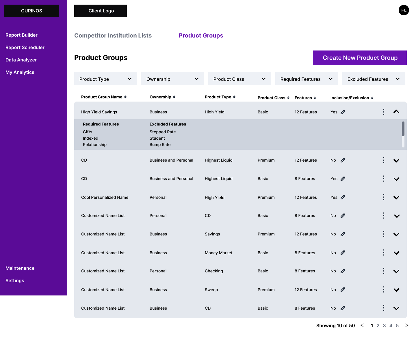
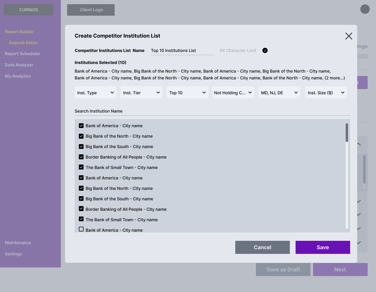
My Institutions Settings
Decide who you are measured against.
Clients build and maintain their own competitor list, set once and carried through every report rather than configured each time.


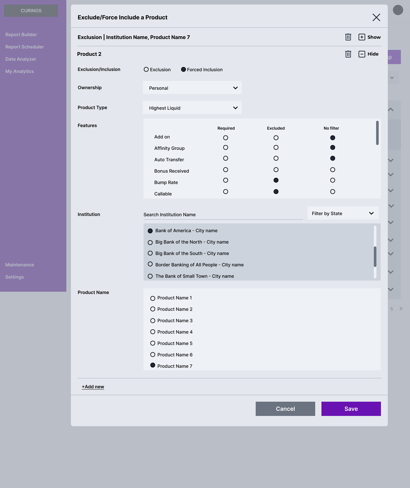
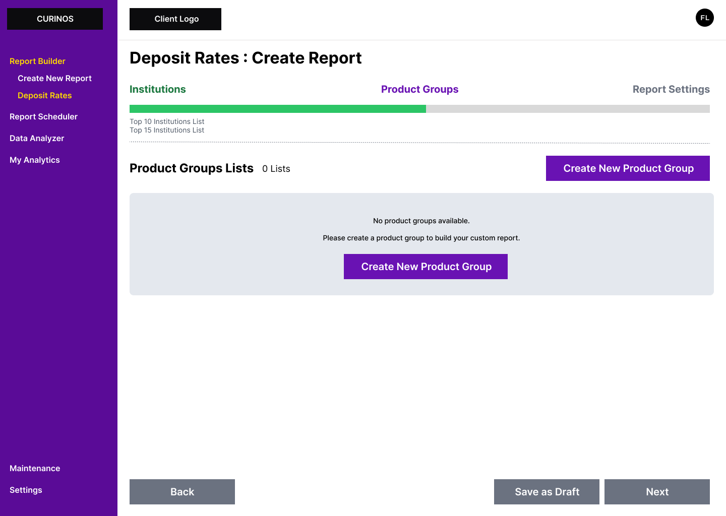
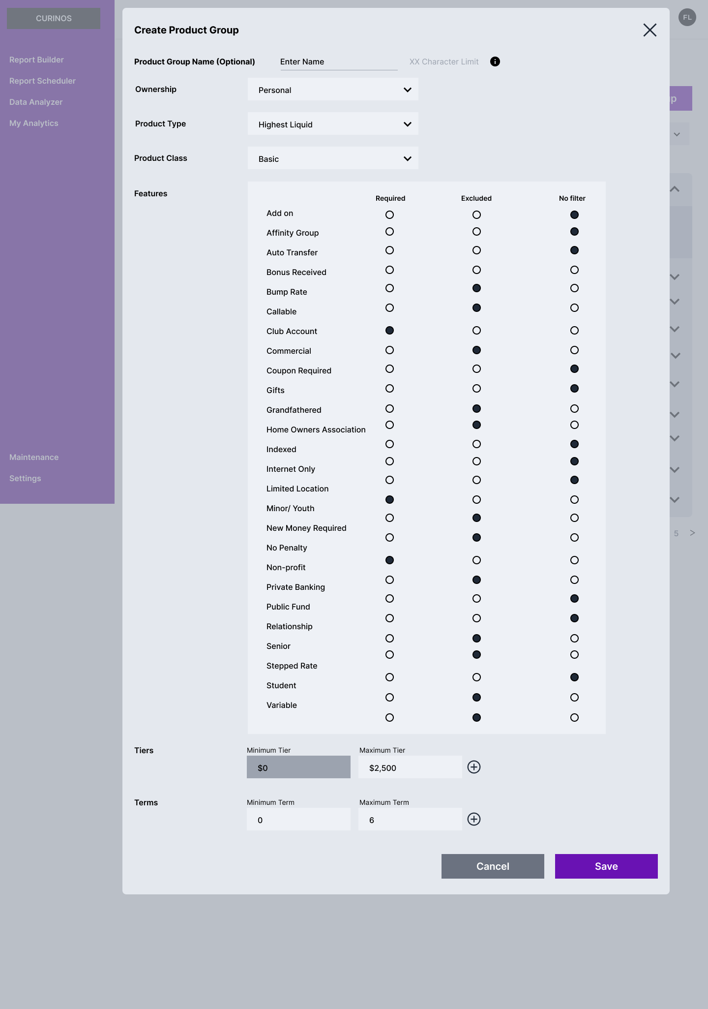
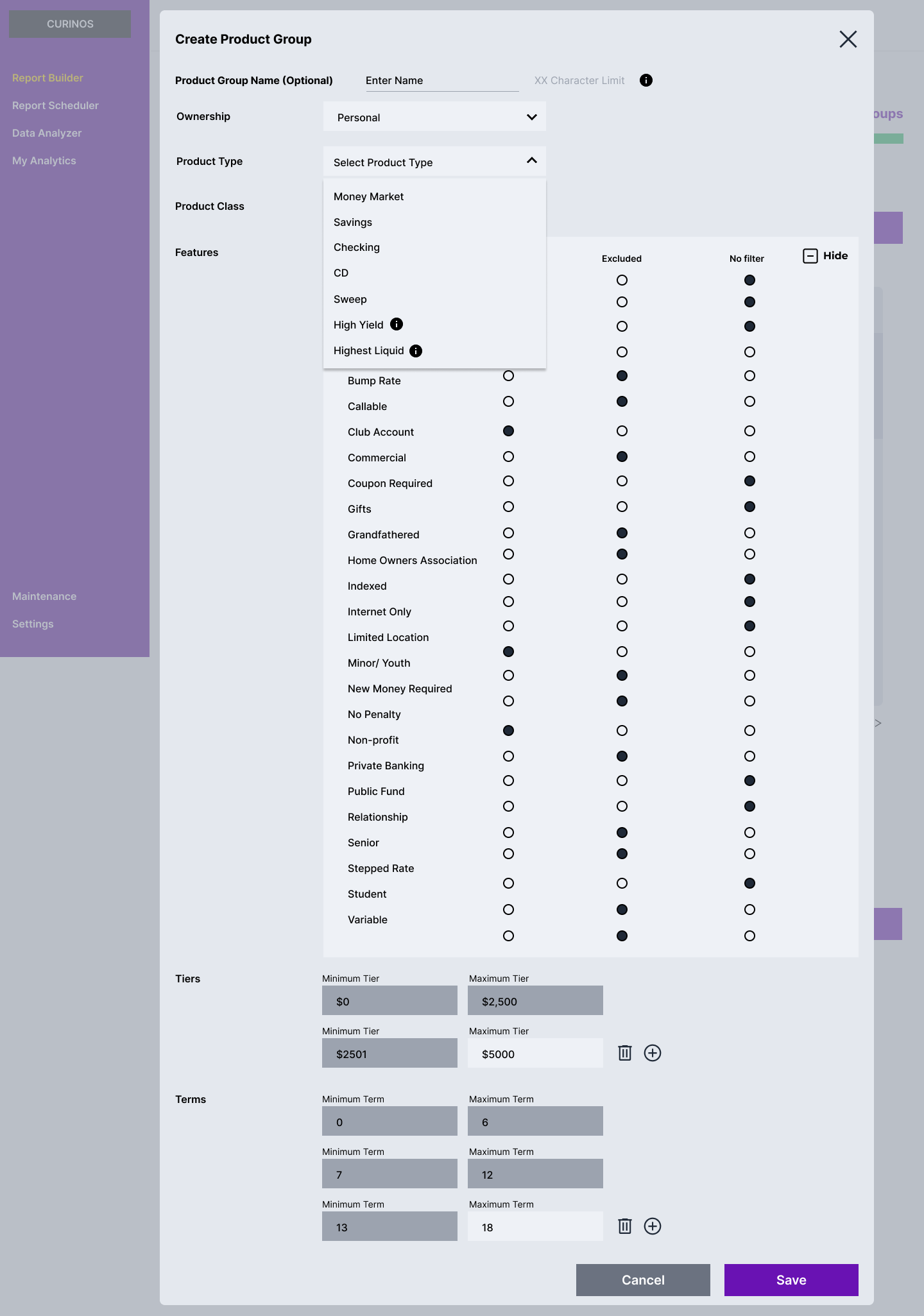
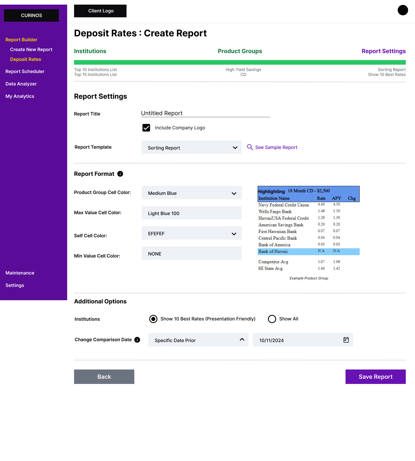
Report Builder - Deposit Rates
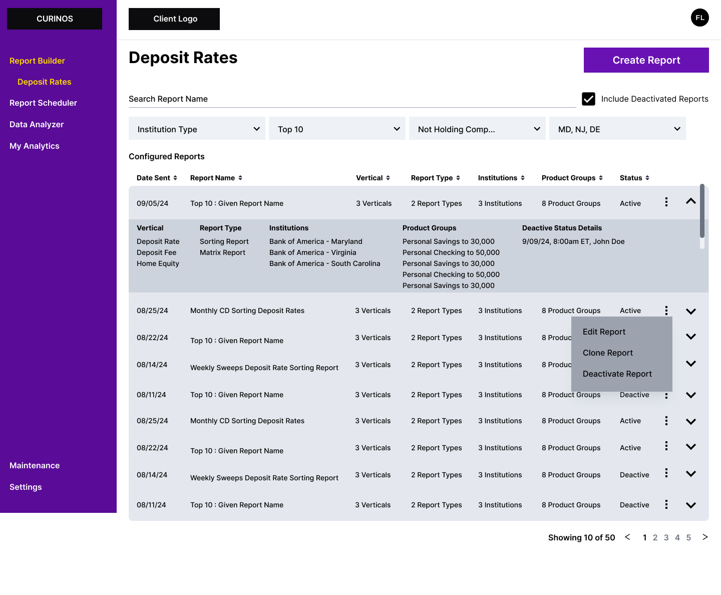
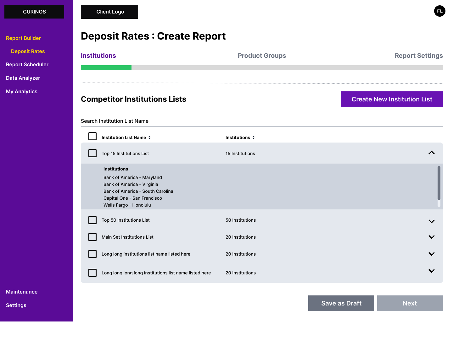
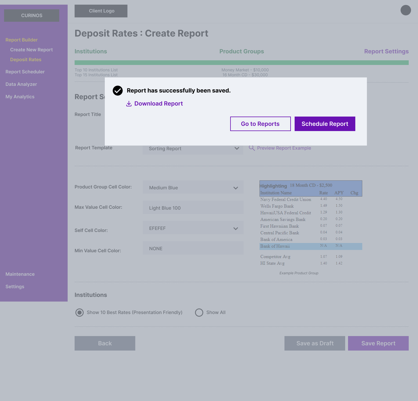
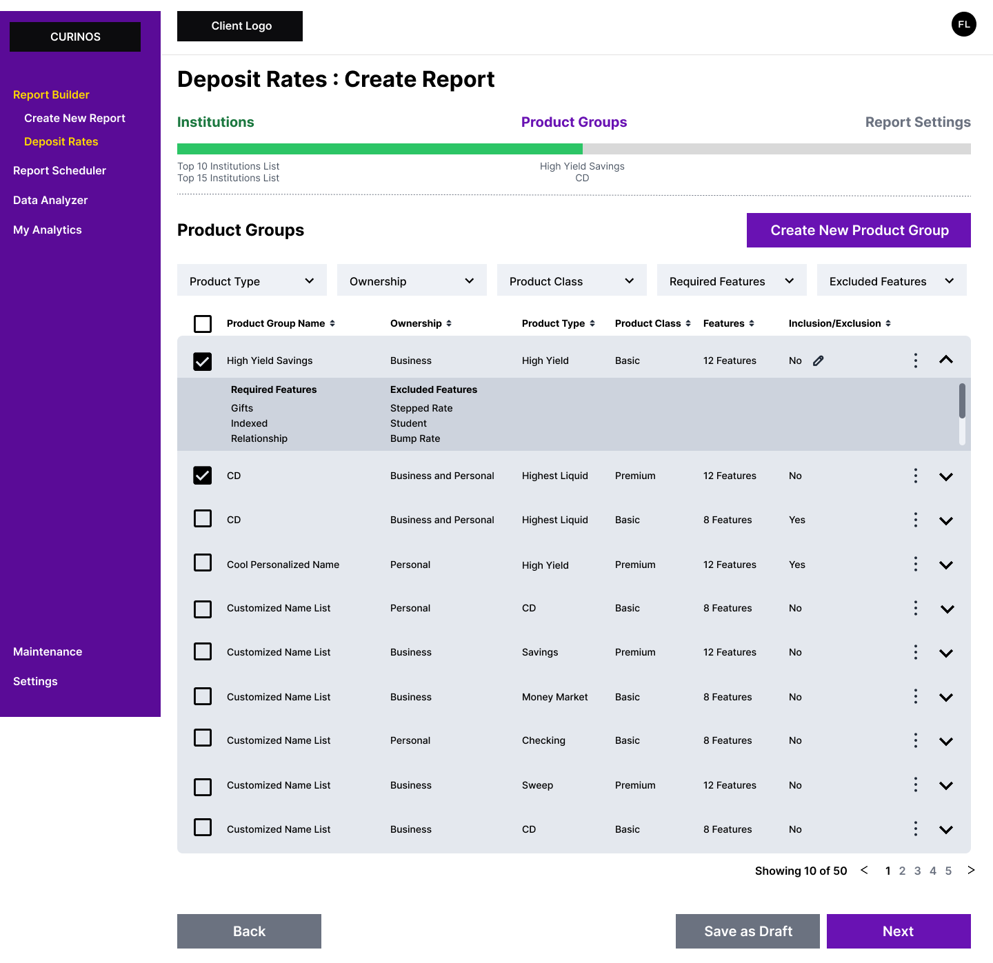
Configure the report yourself, starting with the first vertical.
Clients choose what a report contains and how it is scoped. Deposit rates was the first vertical, built so the ones that follow could use the same pattern.
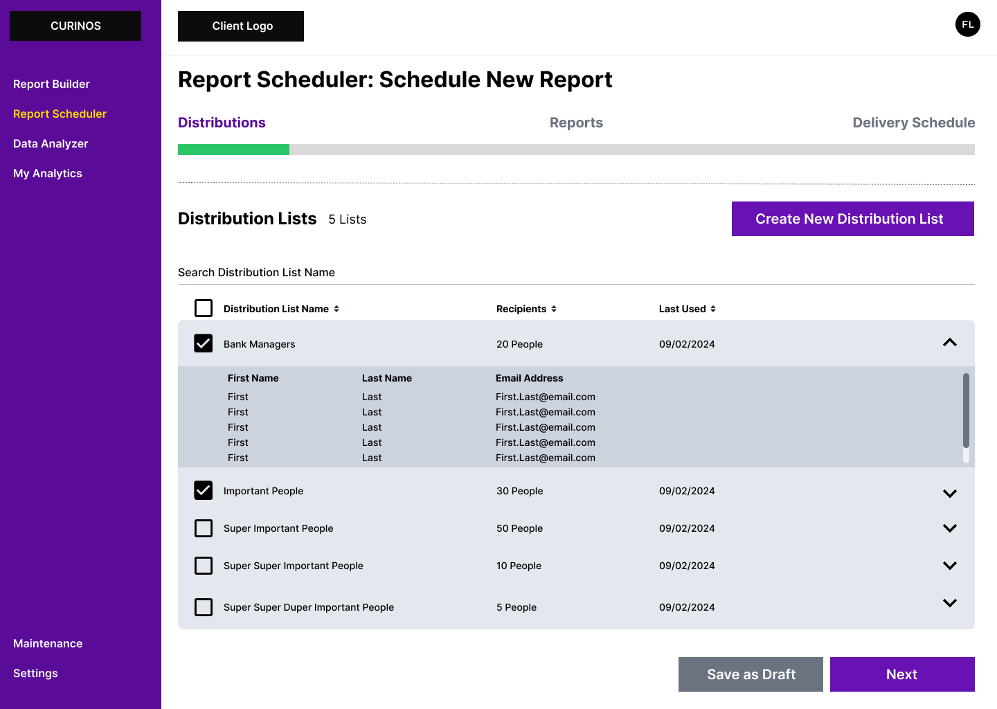
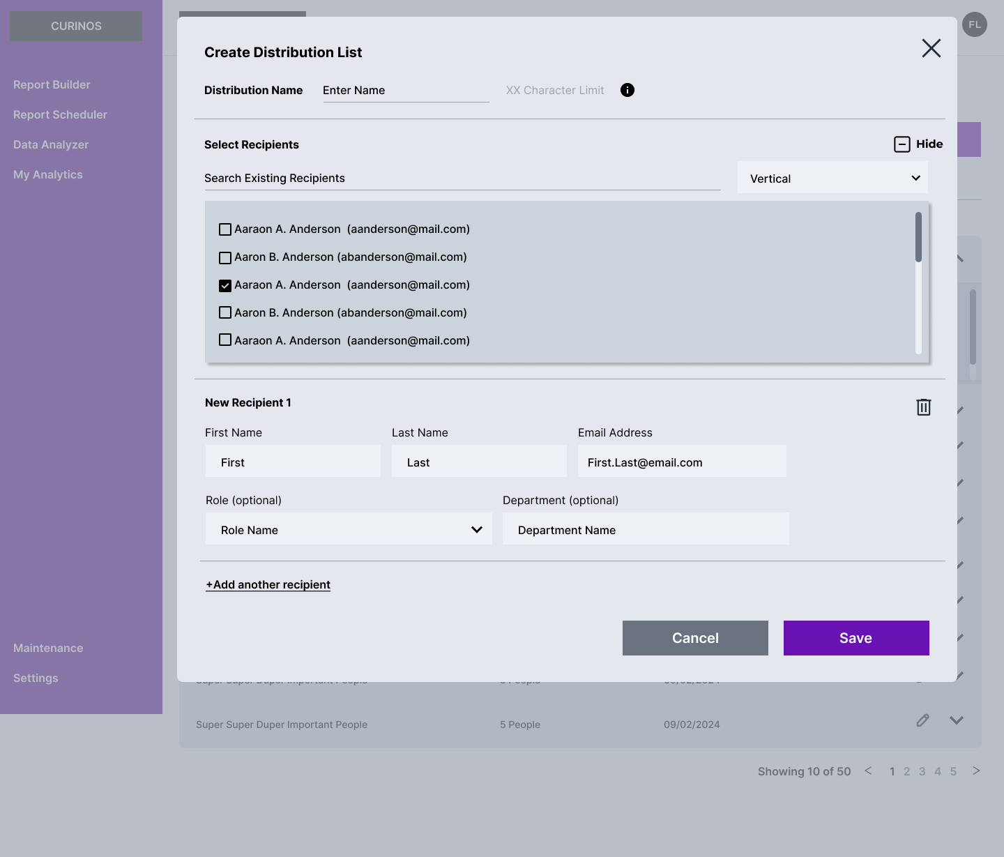
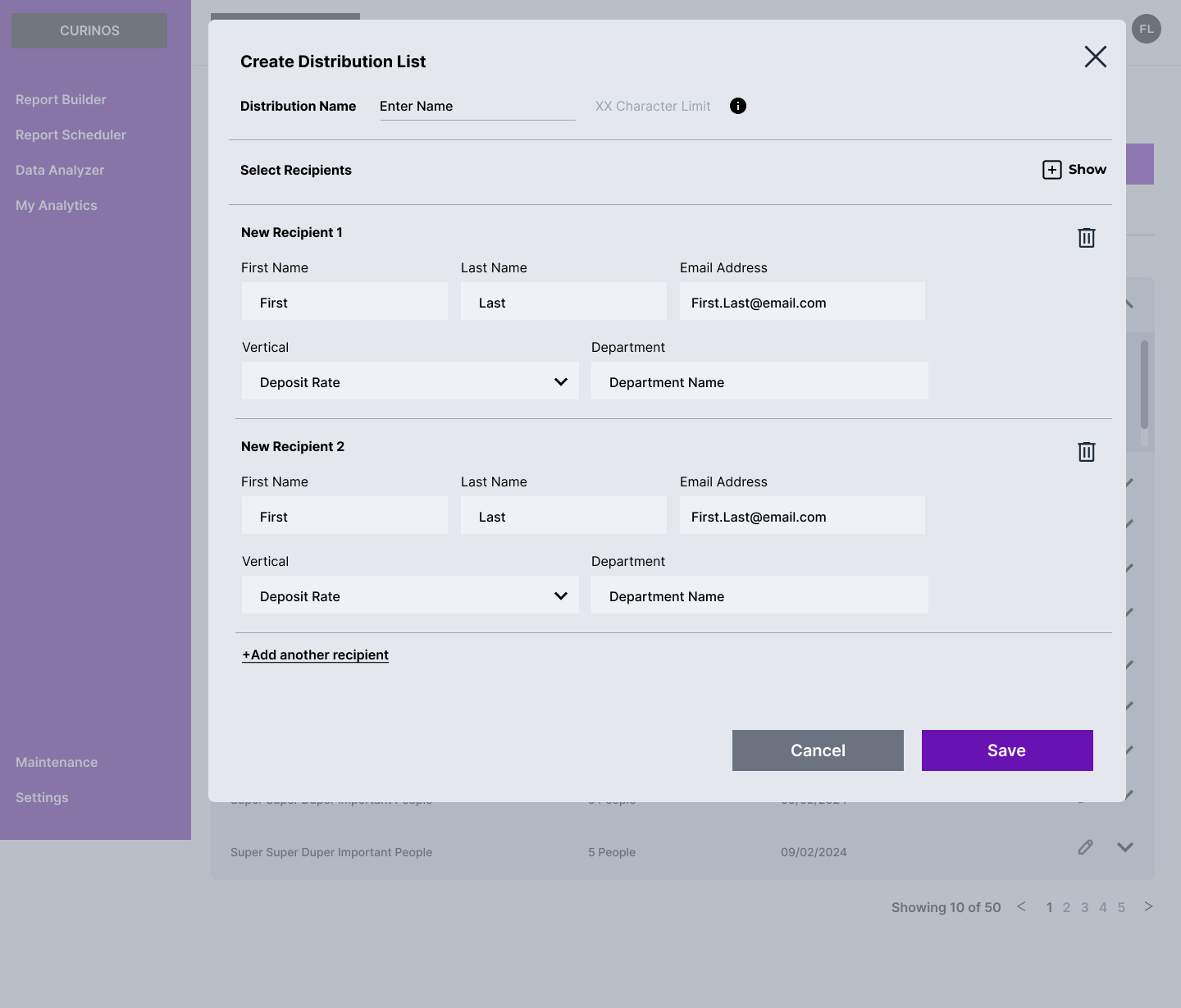
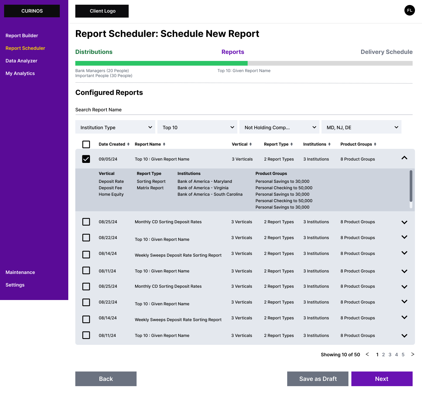
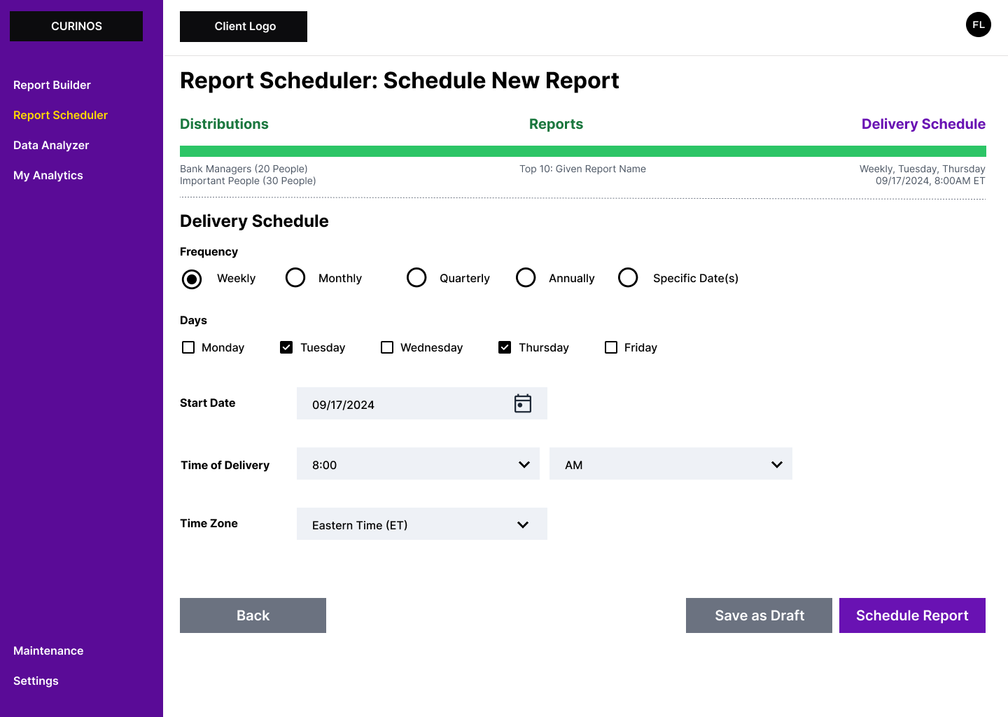
Report Scheduler
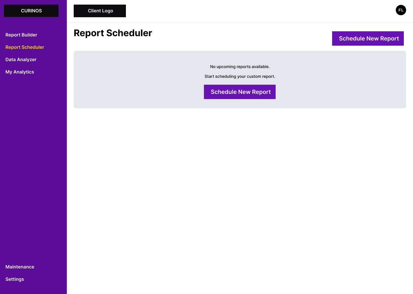
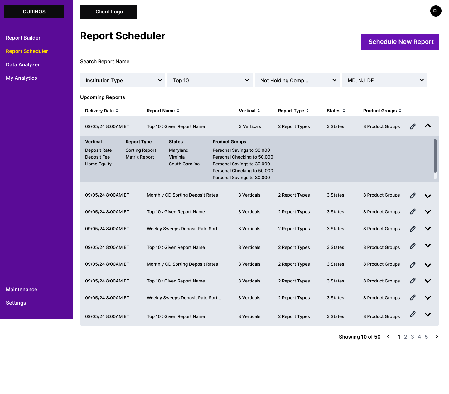
Set the cadence and the distribution list once.
Clients set when reports go out and who receives them, so delivery runs on its own instead of being requested each time.
High fidelity designs
Accessibility, built into the handoff
Accessibility was a top priority, so rather than review the designs after the fact I wrote the documentation developers built from. Every vertical was audited against WCAG 2.2 AA and ARIA best practices, with clear guidance on the code and the practices each screen needed.
Documented across every vertical: headers, alt text, colors, keyboard shortcuts, and the functional behavior of screen readers. Engineering built to it as a guideline, so the MVP reached clients without accessibility gaps to fix afterward.
The documentation outlasted the project. It was reused across other Pricing platform products, and the designer who took the product over after me kept working from the same template.
Where it landed
The MVP shipped and the product is now progressing beyond it.
The high-fidelity prototype became the sales team's walkthrough for pitching the new product to clients, and was widely used across the team. For a product that was still a spinoff on paper, that prototype was how it became real to the people who had to buy it.
What’s next?
QA testing. Reviewing the QA and UAT environment so the MVP is implemented as designed, visually and functionally
Design expansion. Additional Report Builder verticals, including retail lending, pricing benchmark, and product change
User research. UX testing and interviews with beta clients, now that there are clients to test with
New designs. Alerts and notifications, working the same way in the platform and in email